
How To Italicize And Other Fonts Used In The Book Writing?
So you’re writing a book—exciting stuff! But once you’ve poured your heart onto the page, there’s something a little less thrilling to think about: formatting. Fonts, italics, bold—oh my! It might seem like small potatoes, but trust me, these little details can make or break your book’s readability. Whether you’re self-publishing or working with a publisher, knowing how to use italics and choose the right font is crucial.
Let’s break it all down, from when to italicize to which fonts are industry-approved (and which are a big no-no).
Understanding Italics
What Does Italicizing Mean?
Italicizing means slanting the text to the right to give it a different visual style. It’s a classic way to highlight or set apart certain words without using bold or underline. It’s subtle, yet powerful.
When to Use Italics in Books
Here are the most common cases:
- Emphasis: To stress a word or phrase.
- Thoughts: Inner dialogue of a character.
- Titles: Of books, movies, magazines, etc.
- Foreign words: Latin phrases or foreign expressions.
- Names of ships, artwork, etc.: It’s the industry standard.
Understanding Italics

Emphasis and Tone
Ever wanted a word to really pop off the page without yelling (using ALL CAPS)? That’s what italics are for. They let readers “hear” the shift in tone.
Inner Thoughts or Dialogue
Writers often use italics to show what a character is thinking:
Why did I say that? she wondered.
Foreign Words and Phrases
Sprinkle in a little joie de vivre? Italicize it! But if the word has been absorbed into English (like “taco”), no need.
Titles of Other Works
Books, films, magazines—all go in italics:
I just reread Pride and Prejudice last night.
How To Italicize Text in Different Writing Tools
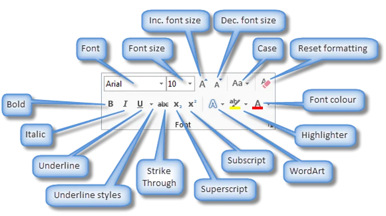
Italicizing in Microsoft Word
- Highlight the text
- Press
Ctrl + I(Windows) orCmd + I(Mac) - Or click the I icon in the toolbar
Italicizing in Google Docs
- Same as Word:
Ctrl + IorCmd + I - Italics button is on the top toolbar
Italicizing in Scrivener
- Select the text and hit
Cmd/Ctrl + I - Or use the formatting menu at the top
Italicizing in Markdown
- Wrap your word in a single asterisk or underscore:
*italic*or_italic_
Font Basics in Book Writing
Serif vs Sans-serif Fonts
- Serif fonts (like Times New Roman) have small strokes at the end of letters. Great for printed books.
- Sans-serif fonts (like Arial) are cleaner and better for screens.
Why Font Style Matters in Publishing
Fonts affect readability, mood, and professionalism. A poor choice can make your masterpiece look like a school project.
Most Common Fonts Used in Book Writing
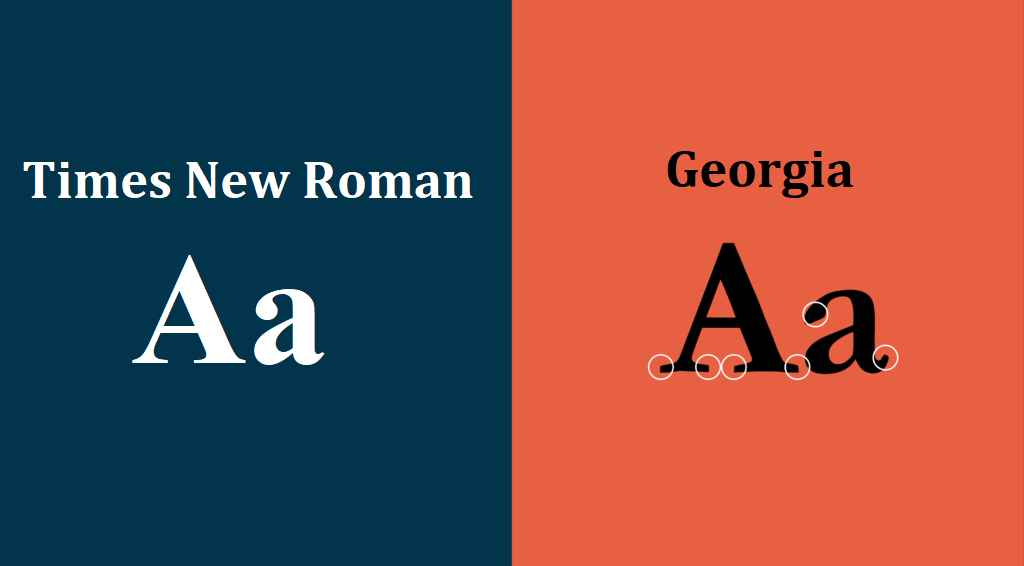
Times New Roman
The old faithful. It’s professional, clean, and loved by editors.
Garamond
Elegant and easy on the eyes. Great for literary fiction or memoirs.
Georgia
Looks amazing both in print and on screen—an excellent choice for ebooks.
Palatino Linotype
A favorite in academic publishing. Formal and traditional.
Baskerville
For a sophisticated look. Often used in classic literature layouts.
Fonts for Print Books vs Ebooks
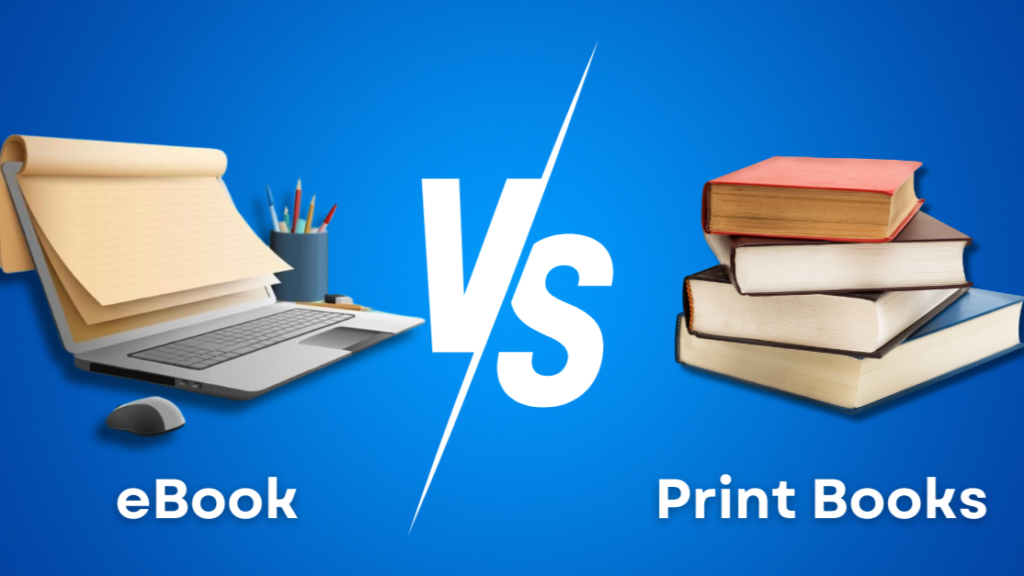
Readability Differences
- Print: Serif fonts work better.
- Ebook: Sans-serif or ebook-optimized fonts like Georgia or Verdana are preferred.
Formatting Considerations
Ebooks can resize fonts automatically, so always test your format. Print books require precise font sizing (usually 11 or 12 pt).
How to Choose the Right Font for Your Book
Genre-Based Font Preferences
- Romance: Garamond or Baskerville
- Thriller: Georgia or Palatino
- Children’s: Larger, friendlier fonts like Century Schoolbook
Publisher Guidelines
Always check with your publisher. Many have strict formatting rules. Self-publishing? Follow Amazon KDP or IngramSpark’s guidelines.
Fonts That Should Be Avoided
Comic Sans and Papyrus
Just don’t. These fonts scream “amateur.”
Decorative or Script Fonts
They might look fancy, but they kill readability—especially in long-form content.
Formatting Tips for Italics and Fonts

Consistency Is Key
Choose one font for the body and stick to it. Same goes for italics: don’t alternate between italics and underlining.
Avoid Overusing Italics
Italics should highlight—not hijack—the text. Too much can make your book feel melodramatic.
Using Font Styles for Chapter Titles and Headers
Use bold, larger fonts (16–18 pt) for chapter headings. Consider a clean sans-serif like Helvetica or Futura for headers to contrast the serif body font.
Using Style Sheets for Fonts and Italics
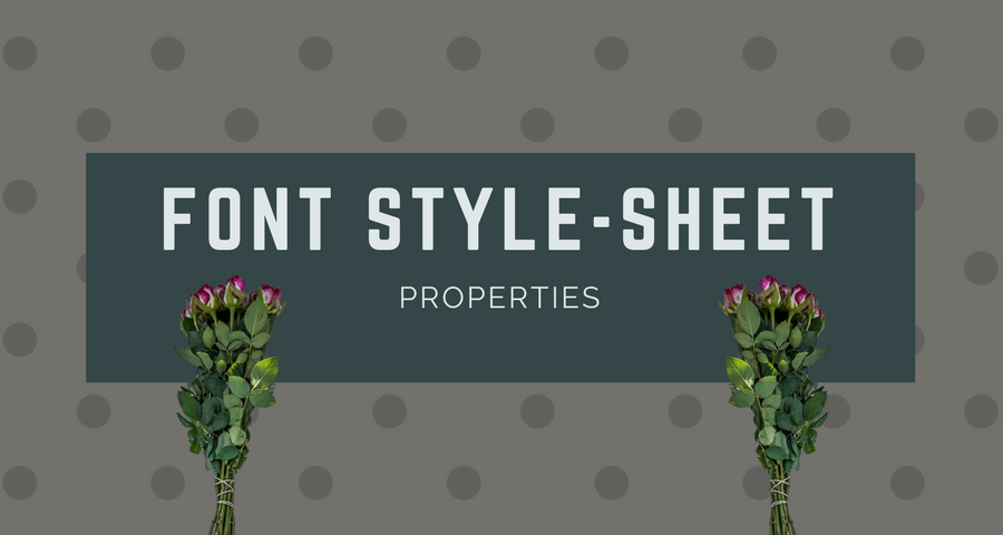
Benefits of Style Sheets
Styles in Word or Scrivener let you apply formatting with one click—saving time and ensuring consistency.
Automating Formatting with Software
Set up your headers, body text, quotes, and italics as predefined styles. That way, everything stays clean and uniform.
Special Considerations for Self-Publishing Authors
How KDP, IngramSpark, Etc. Handle Fonts
They recommend embedding fonts in your PDF. Stick to system fonts or check licensing before using fancy ones.
Embedding Fonts in PDFs
When exporting, always embed fonts to ensure nothing breaks in your layout.
Accessibility and Font Usage
Dyslexia-Friendly Fonts
Try fonts like OpenDyslexic or Lexend. They improve readability for neurodivergent readers.
Font Size and Spacing for Readability
Use 1.15–1.5 line spacing and minimum 11 pt font size. Your readers (and their eyes) will thank you.
Professional Formatting Tools and Services
Formatting Software Recommendations
- Vellum (Mac only)
- Atticus (cross-platform)
- Reedsy Book Editor (web-based and free)
Hiring a Book Formatter
Not confident with formatting? Hire a pro! They’ll handle everything from font choices to layout perfection.
Conclusion
Fonts and italics aren’t just pretty touches—they’re silent storytellers. The right combination enhances readability, sets the tone, and ensures your book meets professional standards. Whether you’re going indie or going big with a publisher, understanding how and when to italicize, and what fonts to use, is a critical part of the process. Don’t overlook it.
So next time you’re tweaking your manuscript, don’t just write the words—style them smartly.
FAQs
1. What font size is best for a printed book?
Typically, 11 or 12 pt is best for the body text in print books. Larger sizes may be used for children’s books.
2. Can I use multiple fonts in one book?
Yes, but use them sparingly. Stick to one for body text and a second (clean and contrasting) font for titles or headers.
3. Is italic the same as slanted text?
Not exactly. Italics are designed to be stylized and slightly slanted versions of the font, while slanted text is just a mechanical tilt.
4. How do I know if a font is copyright-free?
Check sites like Google Fonts or look for fonts labeled as “open license.” Avoid downloading from unverified sources.
5. What font is used in most novels?
Times New Roman, Garamond, and Georgia are commonly used for their readability and traditional publishing look.